The 2026 Colors of the Year: what every major paint brand picked and why it matters
From Pantone's soft white to earthy khakis, burnt umbers and smoky greens, the 2026 Colors of the Year point to a calmer, more grounded home. Here is a brand by brand look at the picks shaping interiors this year.
Every year, as the seasons turn, the design world holds its breath for one of its favorite rituals. One after another, the biggest paint and color brands reveal their Colors of the Year, offering a glimpse into the moods, materials and palettes that will define our homes in the months ahead.
For 2026, a clear and surprisingly harmonious story has emerged across the industry. Instead of loud statements and screen-bright shades, the leading brands are pointing us toward calm, warmth and a deeper connection with nature. Here is a closer look at what each major name chose and what it all means.
A calmer, quieter direction
The overarching theme for 2026 marks a deliberate step back from the saturated, high-energy palettes of recent years. Designers and color experts describe the new direction as an embrace of nuanced, layered tones and an understated sense of spatial calm, prioritizing balance over boldness in the spaces where we live.
Many in the industry read this shift as a gentle antidote to digital fatigue. After years of glowing screens and hyper-stimulating visuals, there is a renewed appetite for restorative environments, material authenticity and the quiet beauty of the handmade, all of which are reflected in this year's softer and more tactile selections.
Pantone bets on white
Perhaps the boldest choice of all came from Pantone, which crowned a soft, billowy white called Cloud Dancer as its Color of the Year. Far from being a plain or empty choice, the shade is presented as a symbol of serenity, clarity and simplicity, a blank canvas that invites calm and a sense of fresh possibility into the home.
The earthy neutrals
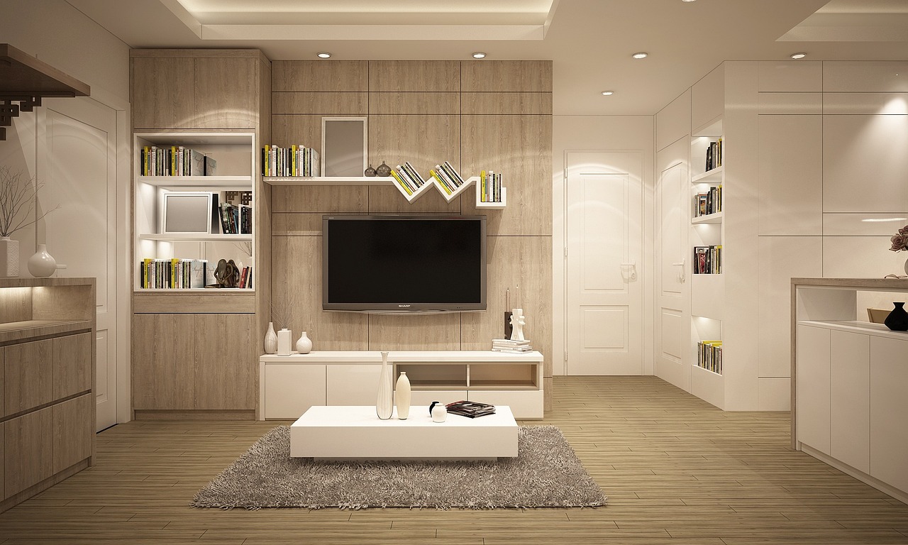
If white sets the tone, a family of warm, grounded neutrals fills in the rest of the picture. Sherwin-Williams selected Universal Khaki, a mid-tone neutral with earthy undertones that the brand describes as being made for long-term use rather than fleeting seasonal trends, a color meant to quietly anchor a room for years.
Other brands echoed this comforting sensibility in their own way. Dutch Boy went with Melodious Ivory, a soft and creamy beige foundation, while C2 Paint chose Epernay, a soft ochre that reflects the growing interest in craft, material authenticity and tactile surfaces that feel good to the touch.
Going darker and richer
Not every brand kept things light, and some of the most striking picks leaned into depth and drama. Benjamin Moore named Silhouette, a luxurious burnt umber with delicate notes of charcoal, a sophisticated shade that gracefully balances warm and cool registers and brings a grounding, cocooning quality to a space.
The appetite for richness continued elsewhere on the spectrum. Graham and Brown selected Divine Damson, a deep plum shade that reveals notes of mulberry and garnet as the light shifts, while Glidden reached for Warm Mahogany, a classic brick red praised for its timeless and enduring appeal.
Green takes root
Green, long associated with nature and renewal, proved to be a quiet favorite for 2026. Behr chose Hidden Gem, a muted, smoky jade that produces subtle shifts in appearance under changing light, giving walls a living, ever so slightly mysterious quality throughout the day.
Valspar joined the movement with Warm Eucalyptus, a muted green with soft undertones intended to support restorative and mindful interiors. AkzoNobel took a slightly different route with Rhythm of Blues, a coordinated trio of tones designed to adapt to a variety of rooms and spatial conditions.
How to use them at home
You do not need to repaint every wall to embrace these colors, and the experts suggest starting small and building slowly. A single feature wall in a smoky green, a set of ivory linens or a burnt umber accent can introduce the mood of 2026 without overwhelming a space or requiring a full and costly renovation.
Taken together, the 2026 palette invites us to slow down and create homes that feel like a genuine refuge from the noise of daily life. Whether you gravitate toward airy whites, grounding neutrals or moody depths, the message this year is refreshingly consistent, calm, warmth and comfort are firmly back in style.